![[머신러닝] Heart Failure Prediction(심부전증 예측)](https://img1.daumcdn.net/thumb/R750x0/?scode=mtistory2&fname=https%3A%2F%2Fblog.kakaocdn.net%2Fdn%2FcIBd2u%2FbtrEdq0pnfS%2FG6b0cKZg9MgcYlg3S2hkDK%2Fimg.png)
캐글 사이트
https://www.kaggle.com/datasets/andrewmvd/heart-failure-clinical-data
Heart Failure Prediction
12 clinical features por predicting death events.
www.kaggle.com
[Heart Failure Prediction
12 clinical features por predicting death events.
www.kaggle.com](https://www.kaggle.com/datasets/andrewmvd/heart-failure-clinical-data)
컬럼
age: 환자의 나이
anaemia: 환자의 빈혈증 여부 (0: 정상, 1: 빈혈)
creatinine_phosphokinase: 크레아틴키나제 검사 결과
diabetes: 당뇨병 여부 (0: 정상, 1: 당뇨)
ejection_fraction: 박출계수 (%)
high_blood_pressure: 고혈압 여부 (0: 정상, 1: 고혈압)
platelets: 혈소판 수 (kiloplatelets/mL)
serum_creatinine: 혈중 크레아틴 레벨 (mg/dL)
serum_sodium: 혈중 나트륨 레벨 (mEq/L)
sex: 성별 (0: 여성, 1: 남성)
smoking: 흡연 여부 (0: 비흡연, 1: 흡연)
time: 관찰 기간 (일)
DEATH_EVENT: 사망 여부 (0: 생존, 1: 사망)
컬럼 개수 : 13개
1. csv파일 열기
# pd.read_csv()로 csv파일 읽어들이기
df = pd.read_csv('/content/heart_failure_clinical_records_dataset.csv')
2. EDA
2.1 데이터프레임의 각 컬럼 분석하기 - head

2.2 데이터프레임의 각 컬럼 분석하기 - info

모든 데이터가 299개로 결측치가 없음을 알 수 있다.
2.3 데이터프레임의 각 컬럼 분석하기 - describe()

[anaemia, diabetes, high_blood_pressure, sex, smoking] 컬럼은 카테고리 데이터임을 알 수 있다.
(최소는 0, 최대는 1로 0과 1로 분류)
[age, creatinine_phosphokinase, ejection_fraction, platelets, serum_creatinine, serum_sodium] 컬럼은 수치형 데이터임을 알 수 있다.
2.4 수치형 데이터 히스토그램 그려보기
2.4.1 히스토그램 - 나이 & 죽음
DEATH_EVENT ( 0 : 생존, 1 : 사망 )
- 40 ~ 65 세는 사망률보다 생존률이 높은편이다.
- 70세 이상부터는 사망률이 높은편이다.
# seaborn의 histplot을 이용해 히스토그램 그리기

fig, axes = plt.subplots(1, 2, figsize=(12,5))

axes = fig.add_subplot(1, 2, 1)
sns.histplot(x='age' , data = df, hue= 'DEATH_EVENT' , kde = True)
axes = fig.add_subplot(1, 2, 2)
sns.histplot(x='age' , data = df, hue= 'DEATH_EVENT' , kde = False)
kde = Kernel Density Estimation(커널밀도추정)
Kernel Density Estimation(커널밀도추정)에 대한 이해
얼마전 한 친구가 KDE라는 용어를 사용하기에 KDE가 뭐냐고 물어보니 Kernel Density Estimation이라 한다. 순간, Kernel Density Estimation이 뭐지? 하는 의구심이 생겨서 그 친구에게 물어보니 자기도 잘 모른.
darkpgmr.tistory.com
2.4.2 히스토그램 - 크레아틴키나제 검사 결과
# seaborn의 histplot을 이용해 히스토그램 그리기
sns.histplot(data = df.loc[df['creatinine_phosphokinase'] < 3000, 'creatinine_phosphokinase'])

2.4.3 히스토그램 - 박출계수(%) & 죽음
# seaborn의 histplot을 이용해 히스토그램 그리기
fig, axes = plt.subplots(2,2, figsize=(16,12) )

sns.histplot(data = df, x='ejection_fraction', ax=axes[0,0])
axes[0,0].set_title('No options')

sns.histplot(data = df, x='ejection_fraction', bins = 13 , ax=axes[0,1])
axes[0,1].set_title('bin = 13')

sns.histplot(data = df, x='ejection_fraction', bins=13 , hue = 'DEATH_EVENT',ax=axes[1,0])
axes[1,0].set_title('bin = 13, hue=DEATH_EVENT')

sns.histplot(data = df, x='ejection_fraction', bins = 13,hue = 'DEATH_EVENT', kde=True, ax=axes[1,1])
axes[1,1].set_title('bin = 13, hue=DEATH_EVENT, kde=True')
2.4.4 히스토그램 - 관찰기간 & 죽음
time : 관찰기간(일)
- 관찰기간은 최소 4일부터 최대 285일까지다.
- 관찰기간이 60일 이하인 환자는 사망률이 높다
- 관찰기간이 200일 이상인 환자는 사망률이 급격히 낮아진다.( 의사들이 말하는 안정기가 200일 이후부터인가...)
# seaborn의 histplot을 이용해 히스토그램 그리기
sns.histplot(x='time', data=df, hue='DEATH_EVENT', kde=True)
2.4.5 조인트 플롯
platelets : 혈소판 수 (kiloplatelets/mL)
creatinine_phosphokinase: 크레아틴키나제 검사 결과
# seaborn의 jointplot을 이용해 히스토그램 그리기
sns.jointplot(x='platelets', y='creatinine_phosphokinase', hue='DEATH_EVENT', data=df, alpha=0.3)
2.4.6 조인트 플롯
serum_creatinine : 혈중 크레아틴 레벨 (mg/dL)
# seaborn의 jointplot을 이용해 히스토그램 그리기
sns.jointplot(x='ejection_fraction', y='serum_creatinine', data=df, hue='DEATH_EVENT')
2.5 범주별 통계 확인하기
2.5.1 Boxplot - 죽음 & ejection_fraction(박출계수)
ejection_fraction : 박출계수(%)
- 생존자(0)의 박출계수 중앙값은 약 38이다.
- 사망자(1)의 박출계수 중앙값은 약 33이다.
# seaborn의 Boxplot 계열을 사용
sns.boxplot(data = df, x = 'DEATH_EVENT', y= 'ejection_fraction')
2.5.2 Boxplot - 흡연여부 & ejection_fraction(박출계수)
- 비흡연자(0)의 박출계수 중앙값은 약 38이다.
- 흡연자(1)의 박출계수 중앙값은 약 35이다.
# seaborn의 Boxplot 계열을 사용
sns.boxplot(data = df , x = 'smoking', y='ejection_fraction')
2.5.3 violinplot - 죽음 & ejection_fraction(박출계수)
# seaborn의 Boxplot 계열을 사용
sns.violinplot(x='DEATH_EVENT', y='ejection_fraction', data=df)
2.5.4 swarmplot - 죽음 & platelets(혈소판 수) & 흡연여부
sns.swarmplot(x='DEATH_EVENT', y='platelets', hue='smoking', data=df)
3. 모델 학습 준비
3.1 데이터 전처리
3.1.1 수치형 vs 범주형 vs 타겟 설정
- X_num : 수치형 데이터
- X_cat : 범주형 데이터
- y : 타겟 ( death_event )
from sklearn.preprocessing import StandardScaler# 수치형 입력 데이터, 범주형 입력 데이터, 출력 데이터로 구분하기
X_num = df[ ['age', 'creatinine_phosphokinase', 'ejection_fraction', 'platelets', 'serum_creatinine', 'serum_sodium']]
X_cat = df[ [ 'anaemia', 'diabetes', 'high_blood_pressure', 'sex' , 'smoking']]
y = df['DEATH_EVENT']3.1.2 수치형 데이터 - 스케일링
# 수치형 입력 데이터를 전처리하고 입력 데이터 통합하기
scaler = StandardScaler()
scaler.fit(X_num)
X_scaled = scaler.transform(X_num)
X_scaled = pd.DataFrame(data= X_scaled, index = X_num.index, columns = X_num.columns)
X = pd.concat([X_scaled, X_cat], axis = 1)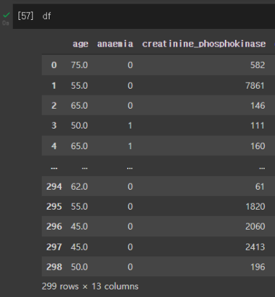

- 스케일링 전후 : age - 75.0 -> 1.19
- 스케일링을 통해 데이터의 스케일을 맞춰줍니다. 안하게 되면 머신러닝이 잘 동작하지 않을 수 있습니다.
[ML] 데이터 스케일링 (Data Scaling) 이란?
스케일링이란? 머신러닝을 위한 데이터셋을 정제할 때, 특성별로 데이터의 스케일이 다르다면 어떤 일이 벌어질까요? 예를 들어, X1은 0 부터 1 사이의 값을 갖고 X2 는 1000000 부터 1000000000000 사이
wooono.tistory.com
3.2 학습데이터(train)와 테스트데이터(test) 분리하기
from sklearn.model_selection import train_test_split# train_test_split() 함수로 학습 데이터와 테스트 데이터 분리하기
X_train, X_test, y_train, y_test = train_test_split(X, y, test_size = 0.3 , random_state = 1)- x_train : train data (데이터)
- x_test : validation data -- test.csv에 있는 데이터(우린 test.csv가 없으니까 나누는 것!)
- y_train : train data (타겟)
- y_test : validation data -- test.csv에 있는 데이터(우린 test.csv가 없으니까 나누는 것!)
- 분리 비중 = train : test = 0.7 : 0.3
4. Classification 분류모델 학습하기
4.1 Logistic Regression 모델
4.1.1 모델 생성 및 학습
from sklearn.linear_model import LogisticRegression# 모델 생성
model_lr = LogisticRegression(max_iter = 1000)
# 모델 학습
model_lr.fit(X_train, y_train)4.1.2 모델 학습 결과 평가하기
from sklearn.metrics import classification_report# Predict를 수행하고 classification_report() 결과 출력하기
pred = model_lr.predict(X_test)
print(classification_report(y_test, pred))
- accuracy(정확도) : 전체 샘플 중 맞게 예측한 샘플 수의 비율 , 높을수록 좋음!
- precision(정밀도) : 양성에 속한다고 출력한 샘플 중 실제로 양성에 속하는 수의 비율 , 높을수록 좋음!
- recall(재현율) : 양성에 속한 표본 중에서 양성 클래스에 속한다고 출력한 표본의 수의 비율 , 높을수록 좋음!
- f1-score : 음..뭐지
4.2 XGBoost 모델
4.2.1 모델 생성 및 학습
from xgboost import XGBClassifier# 모델 생성/학습
model_xgb = XGBClassifier()
model_xgb.fit(X_train, y_train)4.2.2 모델 학습 결과 평가하기
# Predict를 수행하고 classification_report() 결과 출력하기
pred = model_xgb.predict(X_test)
print(classification_report(y_test, pred))
5. 특징의 중요도 확인
# XGBClassifier 모델의 feature_importances_를 이용하여 중요도 plot
plt.bar(X.columns, model_xgb.feature_importances_)
plt.xticks(rotation= 90)
plt.show()
6. 모델 학습 결과 심화 분석
6.1 Precision-Recall 커브 확인하기
from sklearn.metrics import plot_precision_recall_curve# 두 모델의 Precision-Recall 커브를 한번에 그리기 (힌트: fig.gca()로 ax를 반환받아 사용)
fig = plt.figure()
ax = fig.gca()
plot_precision_recall_curve(model_lr, X_test, y_test, ax=ax)
plot_precision_recall_curve(model_xgb, X_test, y_test, ax=ax)
6.2 ROC 커브 확인하기
from sklearn.metrics import plot_roc_curve# 두 모델의 ROC 커브를 한번에 그리기 (힌트: fig.gca()로 ax를 반환받아 사용)
fig = plt.figure()
ax = fig.gca()
plot_roc_curve(model_lr, X_test, y_test, ax=ax)
plot_roc_curve(model_xgb, X_test, y_test, ax=ax)
어느 순간부터 코드만 올라온다고 느끼셨으면 정상입니다...
해석하고 싶지만... 몰라서 해석을 못해요...
아직 공부가 더 필요한 시점입니다...